project summary
For the rebranding of BENT Merkschoenen, the challenge was to craft a fresh visual identity that reflects both its traditional roots and a modern sensibility. While the logo remained untouched, every other visual aspect of the brand’s communication underwent a transformation, creating a future proof bold and consistent style. The goal was to establish an adaptable yet compelling aesthetic that resonates with the brand’s fashion-forward audience.
CATEGORY
Brand Identity
,
Creative Direction
Year
2024
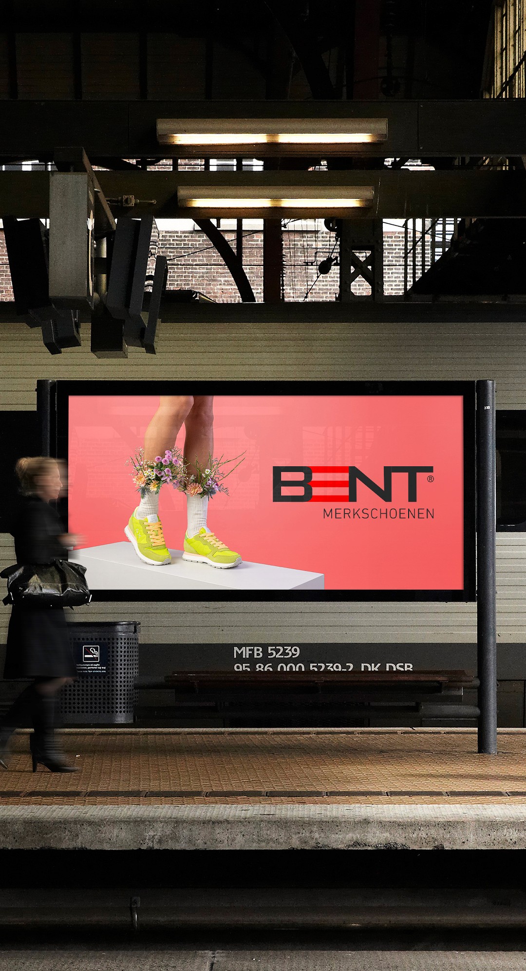
Rethinking the photography style
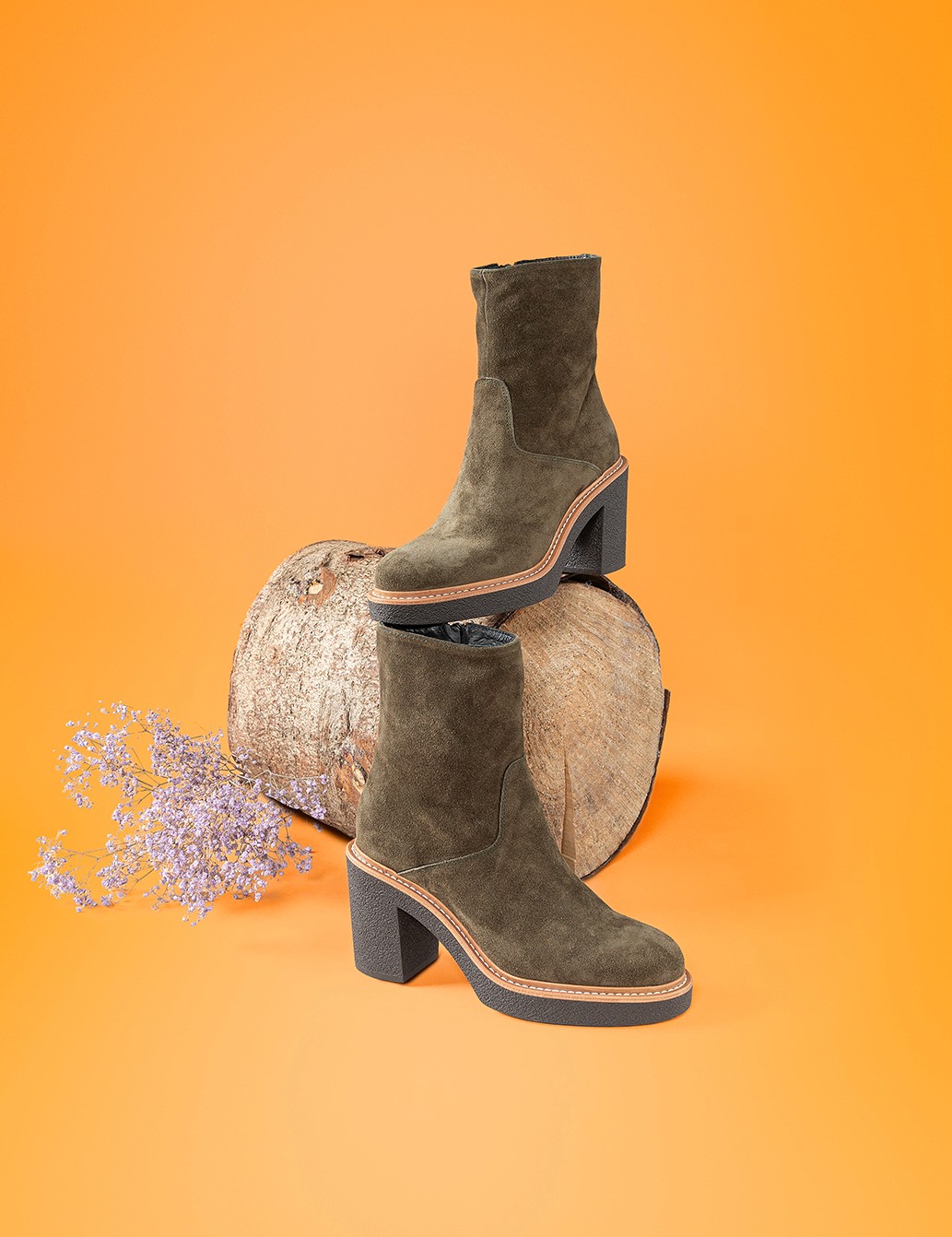
The biggest challenge was the fact that shoes, by nature, make up a small visual proportion of full-body model photos. We needed to emphasize the shoes while maintaining full-body images that captured the lifestyle and meaningfull interactions of BENT’s customers.
The solution was to create photography guidelines that maximized shoe visibility. We played with perspective, pairing footwear with complementary garment colors, and established clear rules for model poses and lighting to ensure the shoes remained the visual highlight, even in full-body images.
concept, visualisation, execution
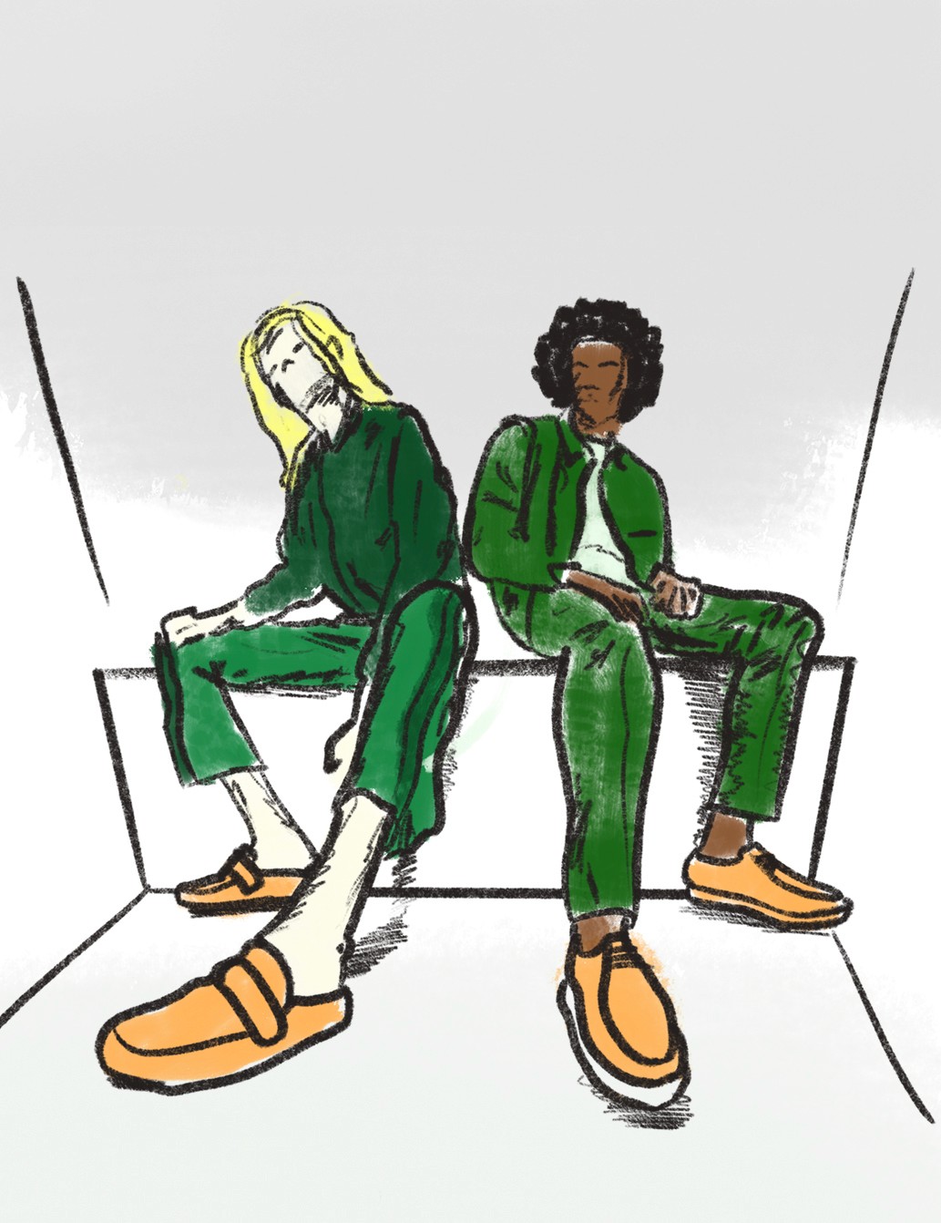
Generative AI accelerated the ideation phase, streamlining sketch and wireframe development by formulating the photography style into a prompt. A visual depiction of the emotions, interactions, look, and feel was visualized for efficient client evaluation.
Generative AI proved to be useful in the initial stage of visualizing the photography style. However, the version of MidJourney at the time had difficulties interpreting our highly specific description of the photo perspectives. As a result, I created sketches to include with the photography pitch.
Drawing from the AI imagery and sketches, clear guidelines were formulated and executed during the studio photoshoot sessions.
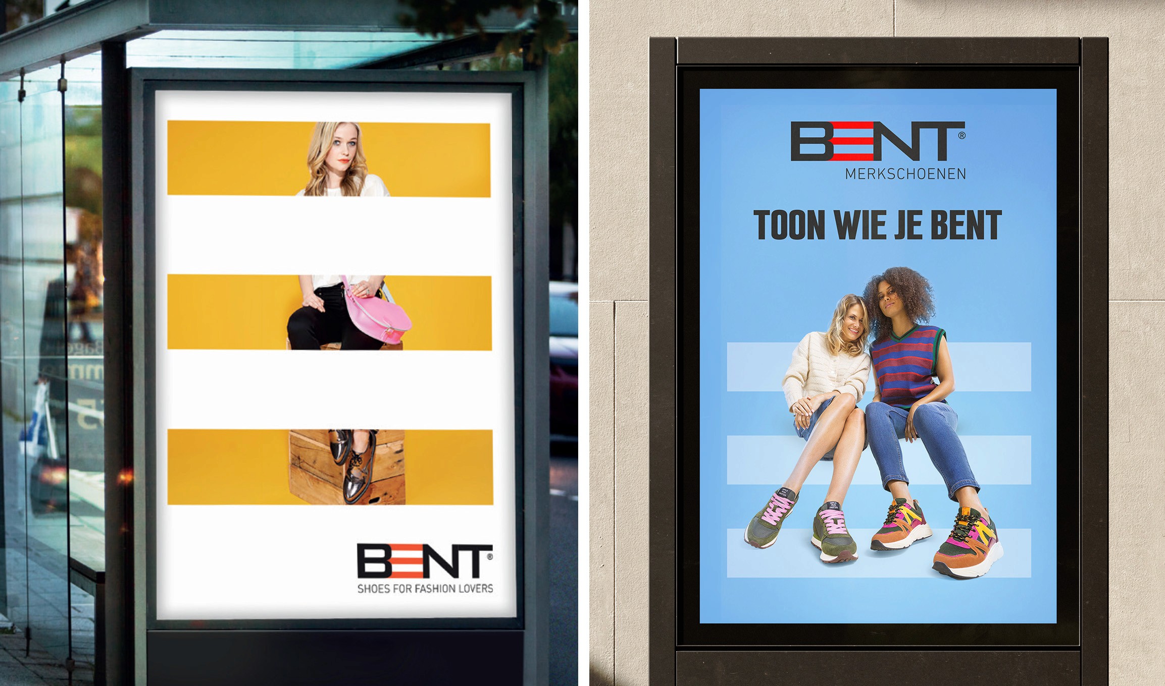
old vs new
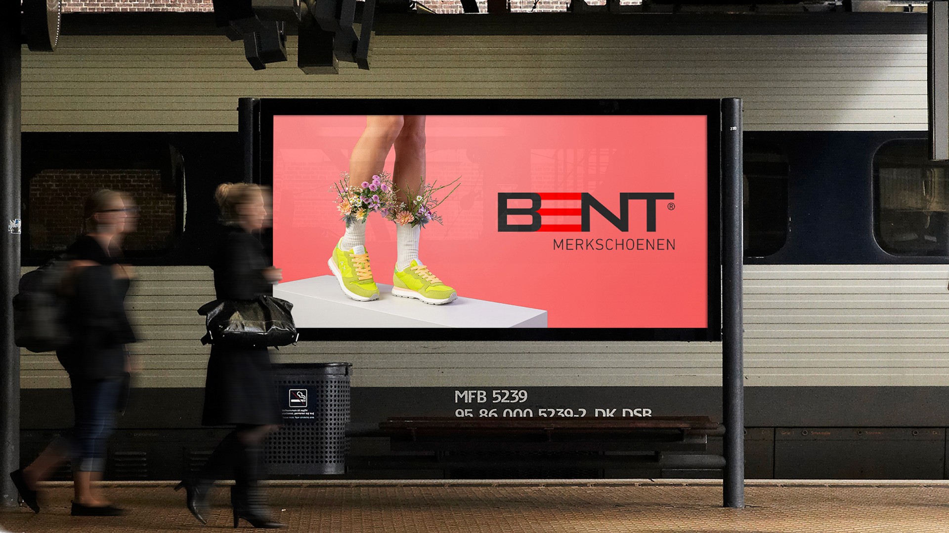
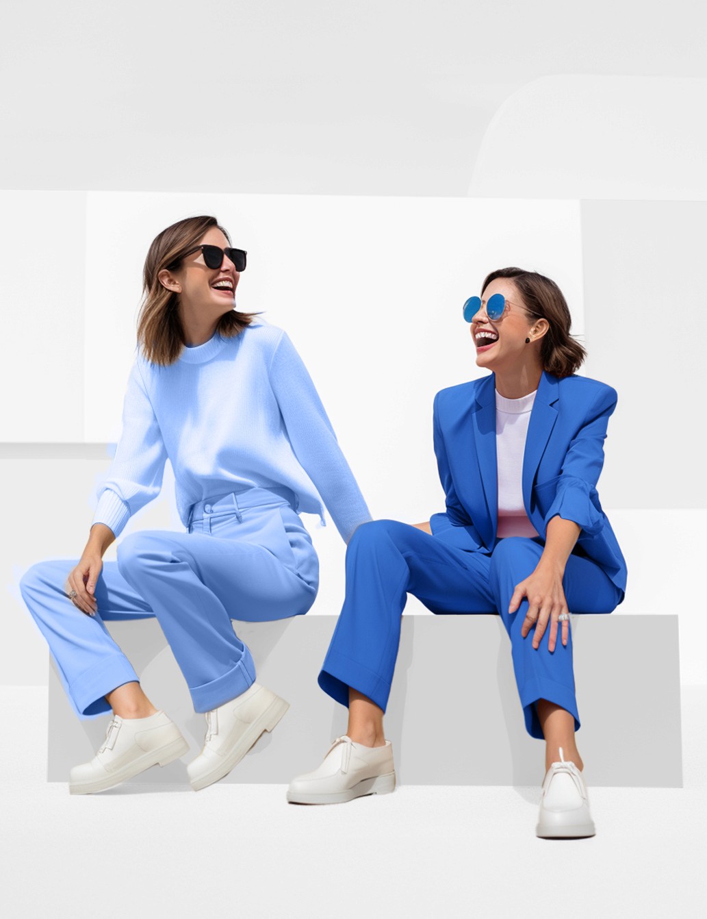
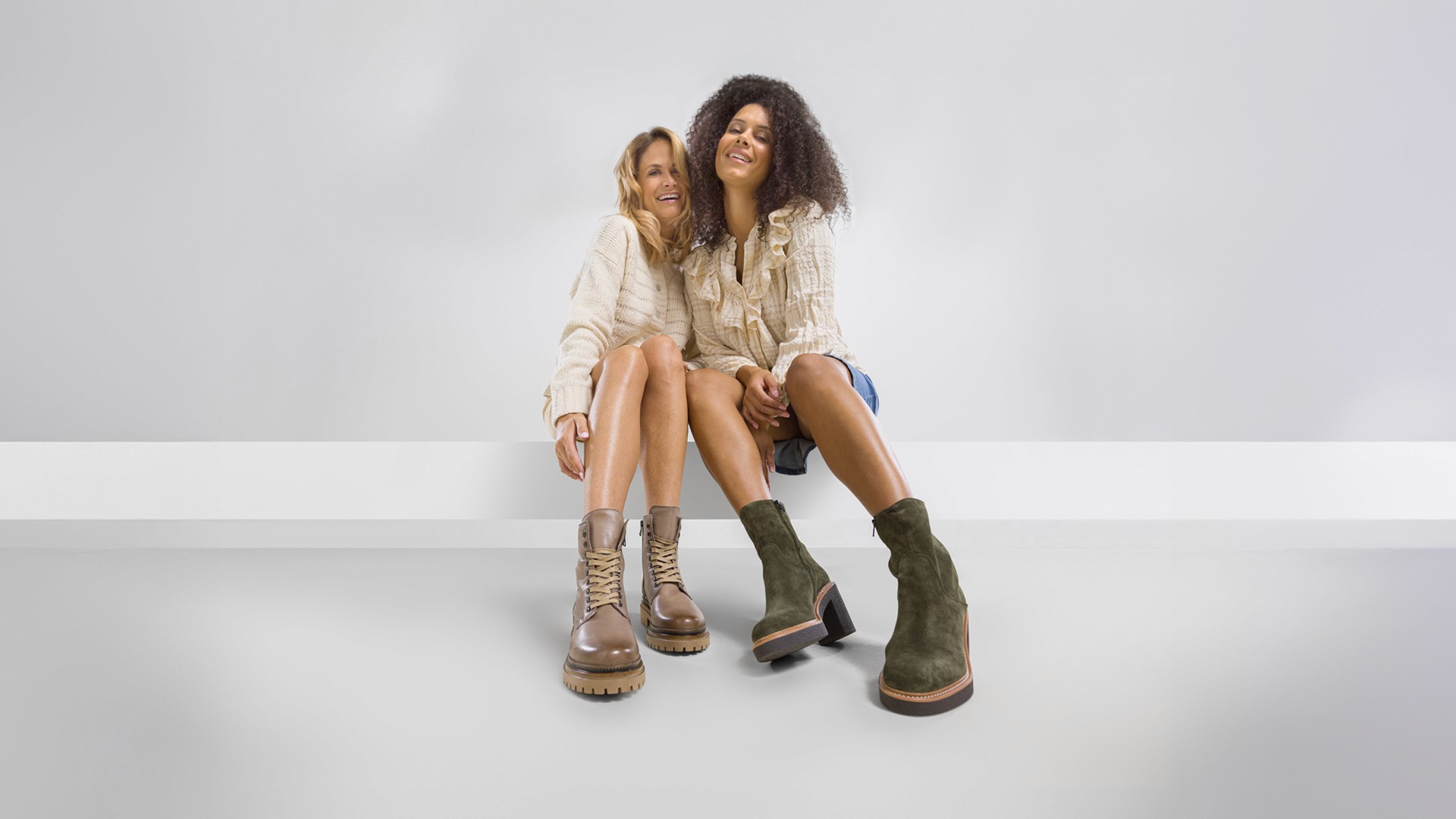
The visual overhaul for BENT started with in-depth research into fashion-forward photography and culture. Inspired by trendy, yet traditional styles to engage their target audience. The next step was to visually capture the lifestyle and confidence, using the new photography style, a refined color palette, and expressive typography to emphasize the brand’s identity.
Old key visual (left): Eye-tracking software analyzed that the visual footprint of the shoes took up 2.77% of the image.
New key visual (right): Eye-tracking software analyzed that the visual footprint of the shoes took up 16.07% of the image.
By rethinking the photography style, the visibility of the shoes increased by 580%.
results
The all-round design employed a minimalist aesthetic, with a bold all-season color palette that conveys confidence and adaptability. This clean approach allowed the shoes to take center stage without distraction of by clutter.
The typography combined playful, quirky headings with serious, classic body text to create a contrast that keeps the design dynamic. The color scheme, mixing bold fall hues with bright summer tones, reinforced this balance of optimistic energy and timeless sophistication.
Imagery was kept simple and clean, with a sharp focus on the shoes. The backdrop was intentionally minimalist, allowing the product to be the focal point in all visual communication, spanning from campaign posters to digital banners.