project summary
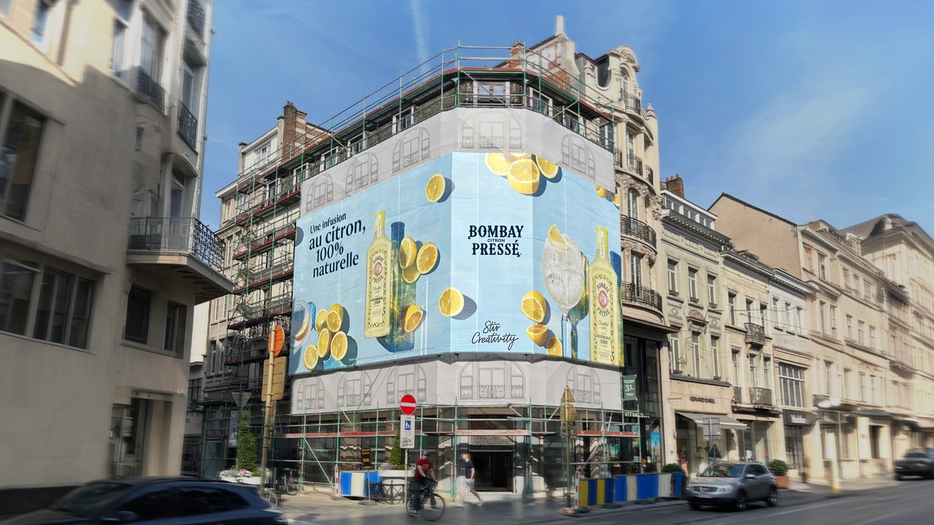
Bombay, a premium beverage brand from the Bacardi-Martini group required the creation of a large-scale activation to promote their Citron Presse product. This out of home installation was placed on a 160m2 space on Avenue Louise, a prestigious shopping area in Brussels with significant urban traffic.
The primary goal was to design an immersive, visually captivating experience that would align with the brand’s identity and position Bombay Citron Presse as a refreshing summer drink. With an estimated 50,000 daily impressions, the challenge was to engage the passersby effectively while enhancing brand awareness through spatial design.
CATEGORY
Spatial Design
,
OOH Advertisement
Year
2023
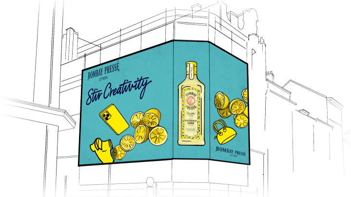
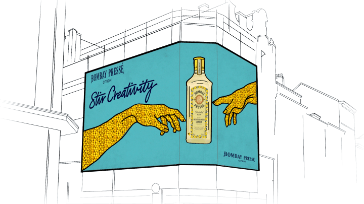
concept sketches
The brainstorm phase focused on Mediterranean-inspired imagery, particularly from coastal regions like
Amalfi, where the vibrant colors and laid-back atmosphere of summer served as key inspiration points.
Four distinct design concepts were developed, each exploring different associations.
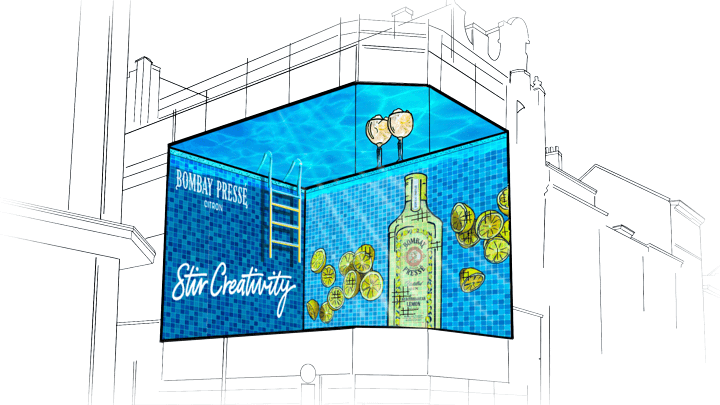
After discussions and review, an adaptation of the “Citron Shopping Spree” concept was selected, as it captured the essence of summer refreshment paired with a high-end experience, making it ideal for the Avenue Louise location.
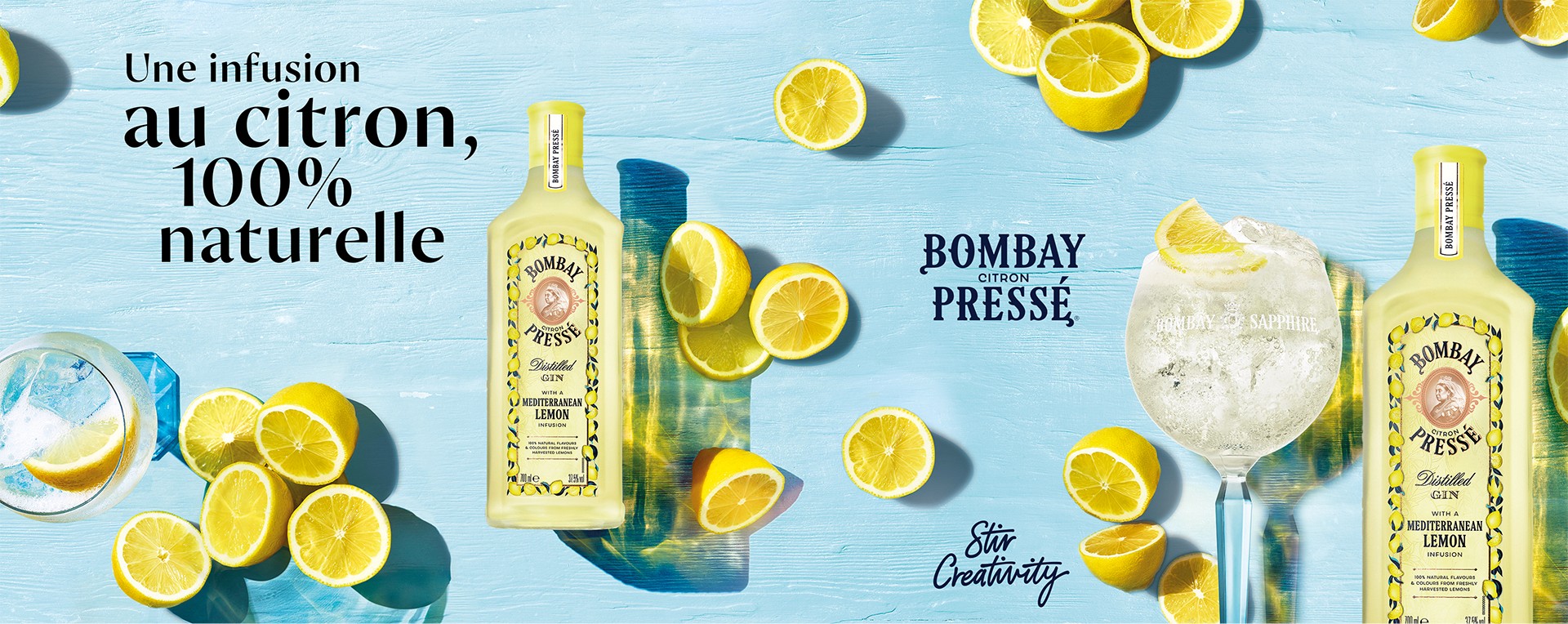
VISUAL EXECUTION
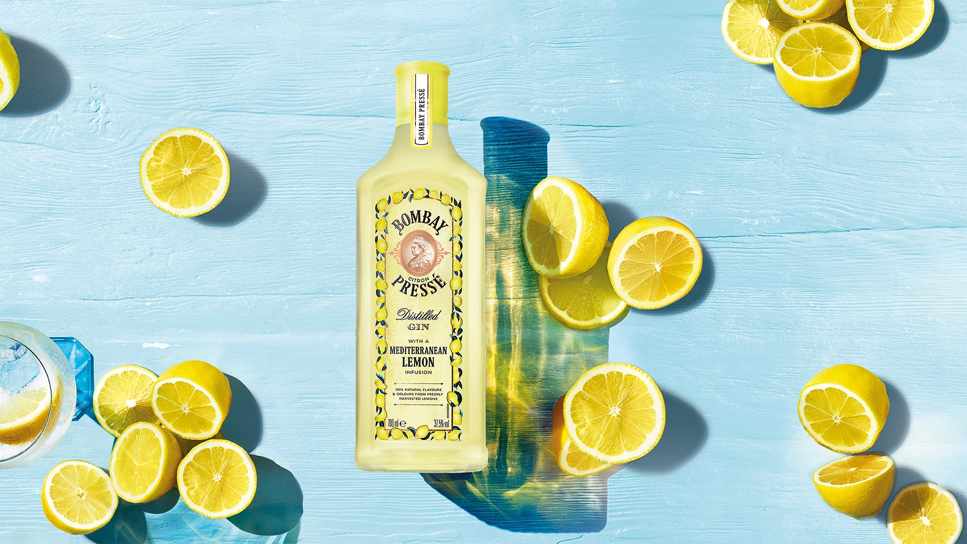
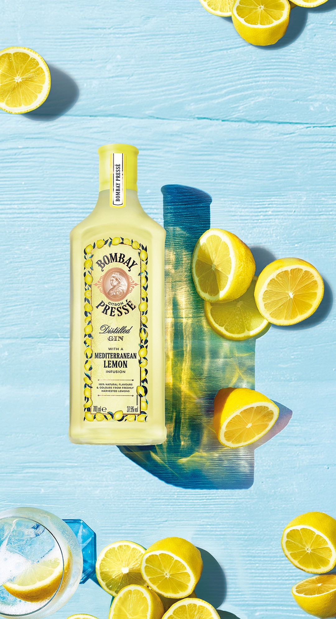
The visual takes shape with a clean, modern aesthetic designed to evoke a sense of lightness and freshness. The design followed principles of visual hierarchy, ensuring that key elements like the brand name and messaging were prominently featured while allowing the space to feel open and inviting.
Bright, engaging imagery of lemons and the product itself were used to create focal points throughout the space. The visual is designed to guide the viewer’s gaze naturally from one element to the next, creating an immersive visual experience that leaves a lasting impression of summer freshness.
researching effective messaging
Sketches and wireframes explored the spatial layout and visual flow of the design. These concepts evolved to ensure an optimized user experience that maximized engagement. The final design reflects a balance between product representation and creative expression.
A focus was placed on contrast, typography, and color balance to ensure the messaging was clear and impactful. Eye-tracking technology and contrast mapping were also employed to validate the visual hierarchy and enhance audience interaction with the key elements of the design.
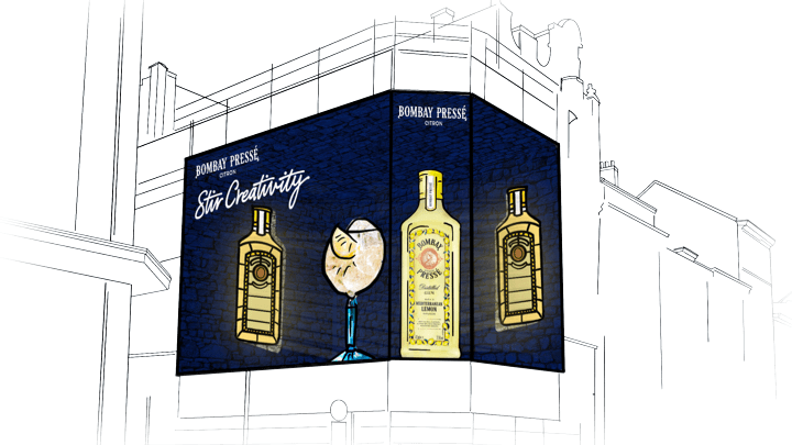
FINISHED PRODUCT
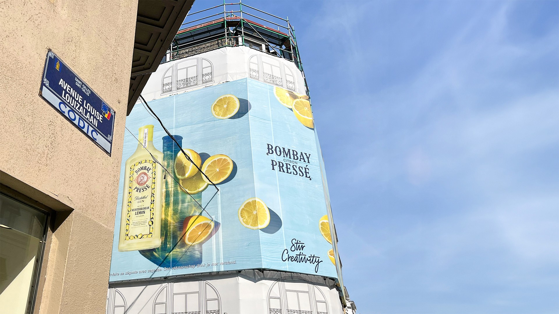
One of the main challenges was adapting the design to the curved facade of the building while ensuring the visual message remained impactful from different angles.
The curved structure was addressed by integrating the flow of the design with the building’s architecture, ensuring that the visual journey felt natural. High-contrast focal points, such as the logo and key messages, were positioned to maximize visibility and engagement.